这些教程主要市基于“modrndive”包(Kim and Ismay 2022)的参考手册和自己浅薄的R使用经验编写,主要目的还是引导重庆的公共卫生人使用R语言分析数据,撰写报告,减轻重复劳动的负担。

图0.1: Family of tidy packages.
1 需要使用到的包:
library(tidyverse) # tidy系列数据分析套装
library(moderndive) # 统计推断、数据模拟,统计学导学
library(nycflights13) # 航班数据库
library(gapminder) # gap minder 数据库
library(gtsummary) # 超棒的统计表格自动生成
library(skimr) # 描述性统计包
library(infer) # 统计推断在R里面对于数据可视化当然要用到数据可视化的王者ggplot2(Wickham et al. 2022)。
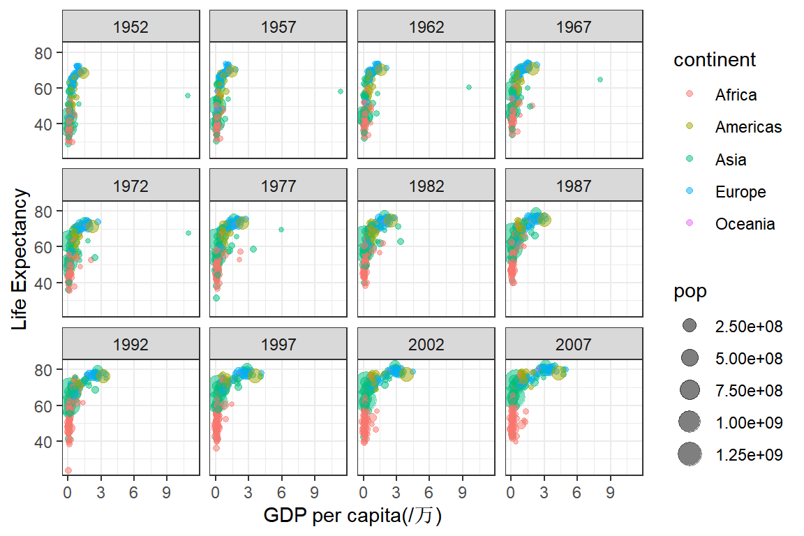
Gapminder 数据
TED talk “The best stats you’ve ever seen”。其中的数据来源就是,随机抽取其中5行数据看看1.1。
| country | continent | year | lifeExp | pop | gdpPercap |
|---|---|---|---|---|---|
| Gambia | Africa | 1997 | 55.9 | 1235767 | 654 |
| Netherlands | Europe | 1997 | 78.0 | 15604464 | 30246 |
| Kuwait | Asia | 2007 | 77.6 | 2505559 | 47307 |
| Chad | Africa | 1962 | 41.7 | 3150417 | 1390 |
| Belgium | Europe | 1987 | 75.3 | 9870200 | 22526 |
我们尝试来展示以下数据中的信息:
2 五种基本的统计图形
- 散点图 scatterplots
- 线图 linegraphs
- 直方图 histograms
- 箱图 boxplots
- 柱状图 barplots
2.1 散点图
散点图也叫双变量图(bivariate plots),主要用于可视化两个变量之间的变化关系。我们使用alaska_flights数据包来学习一下R种散点图的绘制。这个数据包主要是2013年阿拉斯加航空公司的航班数据。
2.1.1 数据概览
使用sample_n()随机抽取5行数据查看一下数据表的结构,也使用head()函数,浏览数据的前5行,使用管道符号%>%(快捷键ctrl+shift+m)可以让我们的代码的可读性更强,你可以将其视为函数结果的传递过程,每个%>%,将上一个函数结果传递至下一个函数。R4.2版本后,增加了原生管道|>,二者的效果一样。
alaska_flights %>% sample_n(5)# # A tibble: 5 × 19
# year month day dep_time sched_dep…¹ dep_d…² arr_t…³ sched…⁴ arr_d…⁵ carrier
# <int> <int> <int> <int> <int> <dbl> <int> <int> <dbl> <chr>
# 1 2013 7 28 715 720 -5 952 1025 -33 AS
# 2 2013 8 15 713 720 -7 944 1025 -41 AS
# 3 2013 2 1 1812 1815 -3 2125 2130 -5 AS
# 4 2013 8 6 1822 1825 -3 2137 2147 -10 AS
# 5 2013 5 23 723 725 -2 937 1015 -38 AS
# # … with 9 more variables: flight <int>, tailnum <chr>, origin <chr>,
# # dest <chr>, air_time <dbl>, distance <dbl>, hour <dbl>, minute <dbl>,
# # time_hour <dttm>, and abbreviated variable names ¹sched_dep_time,
# # ²dep_delay, ³arr_time, ⁴sched_arr_time, ⁵arr_delay由于数据库变量较多,我们用skimr[@{R-skimr]包种的simr()函数,查看各个变量的信息。从结果可以看到整个数据库共有19列,714行,其中字符变量4个,数值变量14个,时间变量1个,后面3张表是对不同类型变量的描述性信息,如:缺失值、最值、中位数、标准差,分位数,直方图等。
alaska_flights %>% skim() | Name | Piped data |
| Number of rows | 714 |
| Number of columns | 19 |
| _______________________ | |
| Column type frequency: | |
| character | 4 |
| numeric | 14 |
| POSIXct | 1 |
| ________________________ | |
| Group variables | None |
Variable type: character
| skim_variable | n_missing | complete_rate | min | max | empty | n_unique | whitespace |
|---|---|---|---|---|---|---|---|
| carrier | 0 | 1 | 2 | 2 | 0 | 1 | 0 |
| tailnum | 0 | 1 | 6 | 6 | 0 | 84 | 0 |
| origin | 0 | 1 | 3 | 3 | 0 | 1 | 0 |
| dest | 0 | 1 | 3 | 3 | 0 | 1 | 0 |
Variable type: numeric
| skim_variable | n_missing | complete_rate | mean | sd | p0 | p25 | p50 | p75 | p100 | hist |
|---|---|---|---|---|---|---|---|---|---|---|
| year | 0 | 1.00 | 2013.00 | 0.00 | 2013 | 2013 | 2013 | 2013 | 2013 | ▁▁▇▁▁ |
| month | 0 | 1.00 | 6.41 | 3.41 | 1 | 3 | 6 | 9 | 12 | ▇▆▆▆▇ |
| day | 0 | 1.00 | 15.79 | 8.85 | 1 | 8 | 16 | 23 | 31 | ▇▇▇▇▆ |
| dep_time | 2 | 1.00 | 1294.56 | 565.66 | 651 | 718 | 1805 | 1825 | 2205 | ▇▁▁▇▁ |
| sched_dep_time | 0 | 1.00 | 1284.50 | 551.95 | 705 | 720 | 1815 | 1825 | 1835 | ▇▁▁▁▇ |
| dep_delay | 2 | 1.00 | 5.80 | 31.36 | -21 | -7 | -3 | 3 | 225 | ▇▁▁▁▁ |
| arr_time | 2 | 1.00 | 1564.89 | 591.37 | 3 | 1003 | 2043 | 2128 | 2355 | ▁▁▇▁▇ |
| sched_arr_time | 0 | 1.00 | 1595.30 | 558.98 | 1015 | 1025 | 2125 | 2145 | 2158 | ▇▁▁▁▇ |
| arr_delay | 5 | 0.99 | -9.93 | 36.48 | -74 | -32 | -17 | 2 | 198 | ▇▇▁▁▁ |
| flight | 0 | 1.00 | 12.19 | 34.26 | 5 | 7 | 7 | 15 | 915 | ▇▁▁▁▁ |
| air_time | 5 | 0.99 | 325.62 | 16.17 | 277 | 314 | 324 | 336 | 392 | ▁▇▇▂▁ |
| distance | 0 | 1.00 | 2402.00 | 0.00 | 2402 | 2402 | 2402 | 2402 | 2402 | ▁▁▇▁▁ |
| hour | 0 | 1.00 | 12.62 | 5.50 | 7 | 7 | 18 | 18 | 18 | ▇▁▁▁▇ |
| minute | 0 | 1.00 | 22.18 | 6.58 | 5 | 20 | 25 | 25 | 35 | ▁▂▆▇▂ |
Variable type: POSIXct
| skim_variable | n_missing | complete_rate | min | max | median | n_unique |
|---|---|---|---|---|---|---|
| time_hour | 0 | 1 | 2013-01-01 07:00:00 | 2013-12-31 18:00:00 | 2013-06-28 12:30:00 | 714 |
2.2 绘制散点图
这里我们简单介绍一下使用ggplot2绘图的一般步骤
- 首先使用
ggplot()函数我们创建一个ggplot对象,换句话说建立一个空白的画板。在aes()中分别定义这个统计图的x轴和y轴的度量变量分别为alaska_flights数据库里的dep_delay和arr_delay。这时的画板是空白的,因为我们没有定义要用哪种图形来展示。
# ggplot(alaska_flights) #这种格式同样可以,但是不利于我们选择变量

alaska_flights %>%
  ggplot(aes(x = dep_delay, y = arr_delay))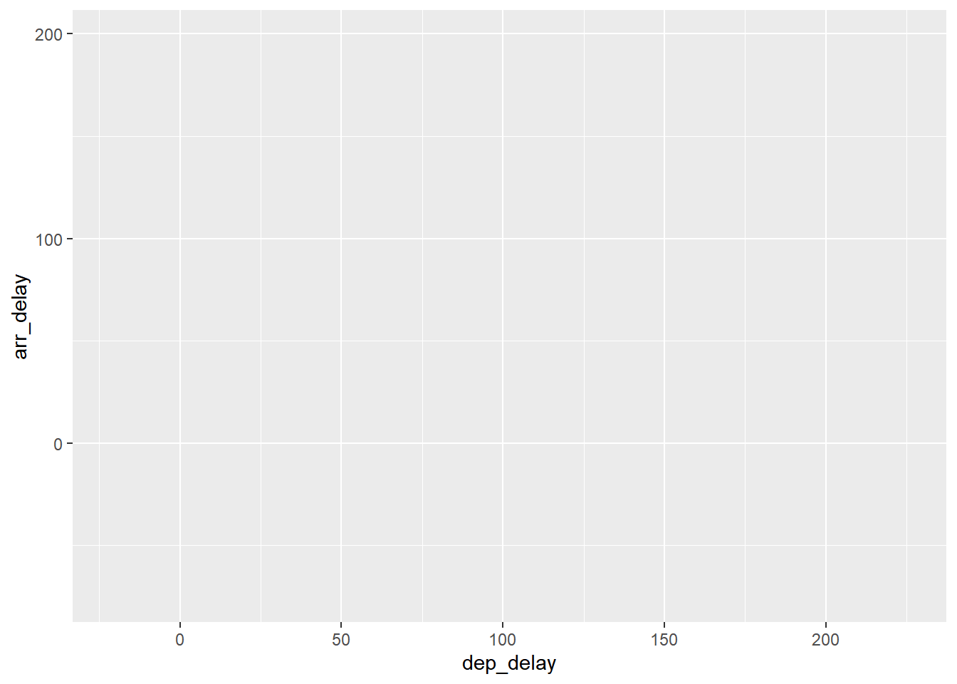
- 使用
+号添加geom_point图层后,一张基础的散点图完成了。程序输出一条warning,提示我们图形移除了5行有缺失值的数据。(图:2.1)
alaska_flights %>%
  ggplot(aes(x = dep_delay, y = arr_delay))+
  geom_point()
# Warning: Removed 5 rows containing missing values (geom_point).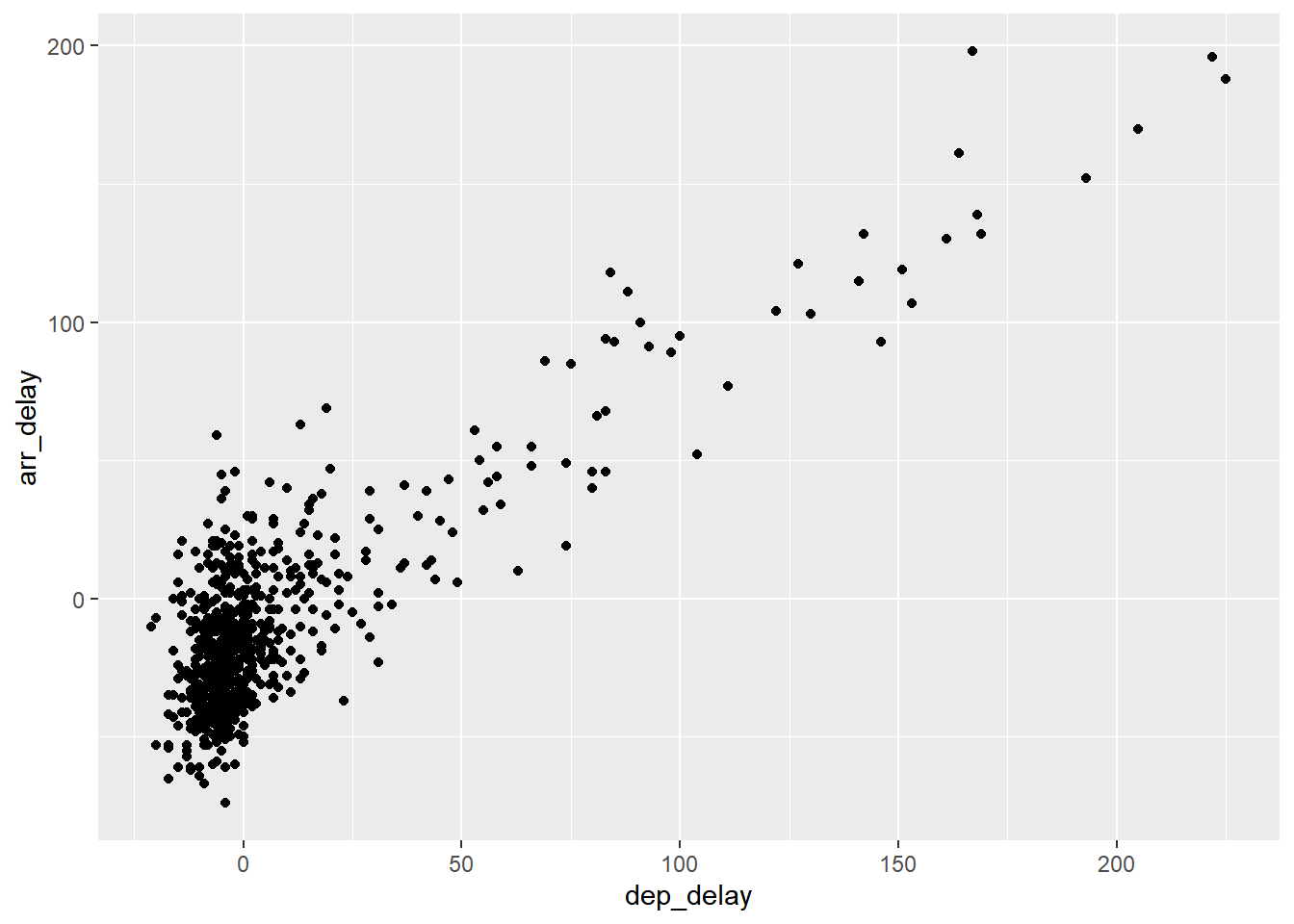
图2.1: Arrival vs. departure delays scatterplot.
- 但是我们发现这个图中“0,0”附近的点都挤在一起,让人难以辨识,一般情况有两种方式解决这个问题,首先是在
geom_point()设置alpha点的透明度。这样,我们可以更明显地看出数据的集中趋势。(图:2.2)
alaska_flights %>%
  ggplot(aes(x = dep_delay, y = arr_delay))+
  geom_point(alpha = 0.2)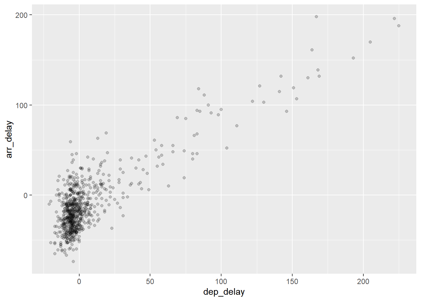
图2.2: Arrival vs. departure delays scatterplot with alpha = 0.2.
- 第二种方案可以使用
geom_jitter()替代geom_point()或者在geom()中使用position = position_jitter(),给每个数据点的位置添加随机扰动,降低重叠程度。width = , height =参数可以控制扰动的大小。(图:2.3)
alaska_flights %>%
  ggplot(aes(x = dep_delay, y = arr_delay))+
  geom_point(position = position_jitter(width = 20, height = 20))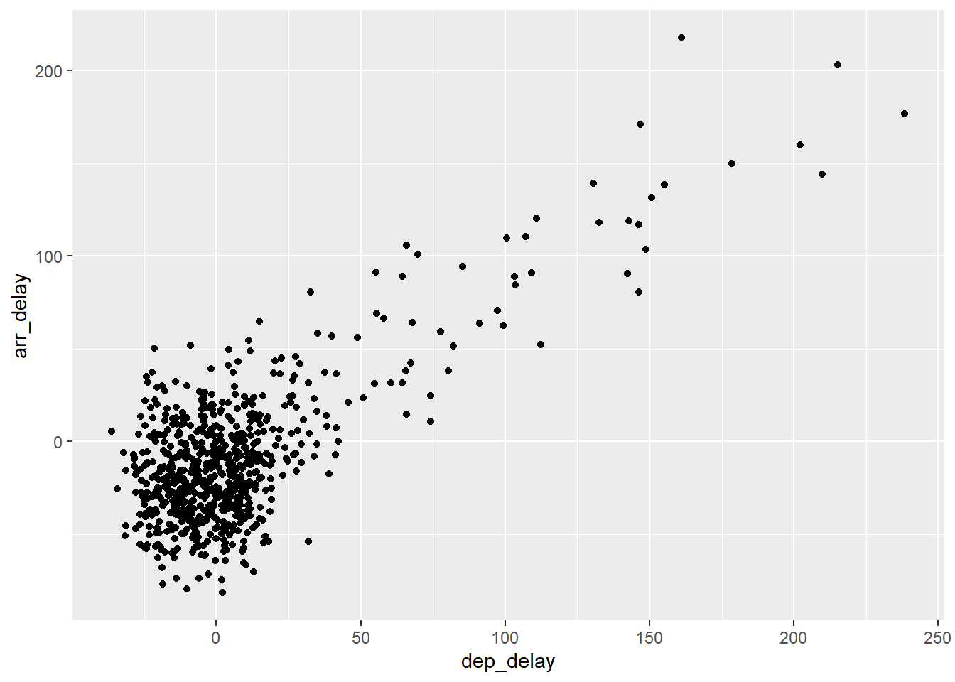
图2.3: Arrival versus departure delays jittered scatterplot.
- 我们可以在
aes()在添加其他分类变量来展示分组的信息,如颜色,点形状,大小等,使用theme_bw()添加一个图形主题(图:2.4)
alaska_flights %>%
  ggplot(aes(x = dep_delay, y = arr_delay))+
  geom_point(aes(col = factor(flight), size = hour),
             alpha = 0.5,
             position = position_jitter(width = 30, height = 30),
             )+
  theme_bw()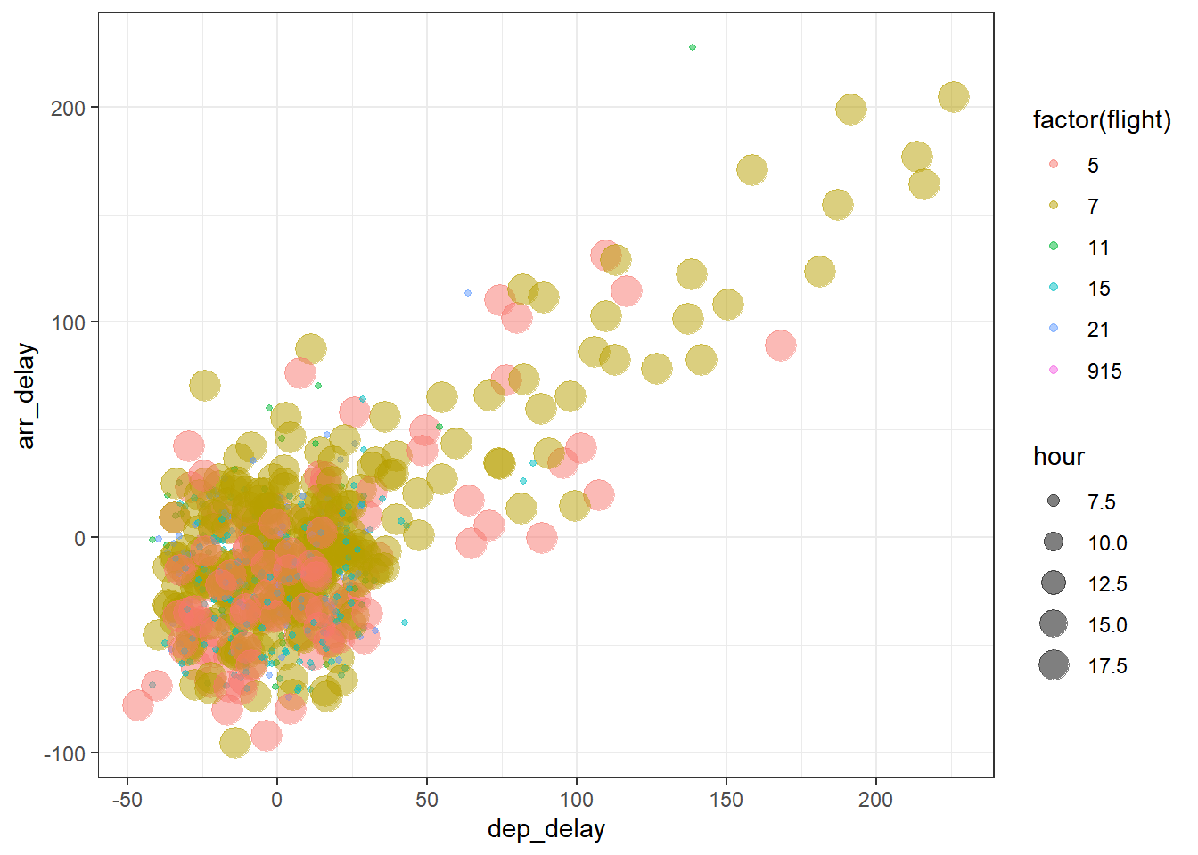
图2.4: Arrival versus departure delays jittered scatterplot with groups.
2.3 线图
用线图来展示early_january_wether数据库中的信息:
ggplot(data = early_january_weather,
       mapping = aes(x = time_hour, y = temp, col = pressure)) +
  geom_line()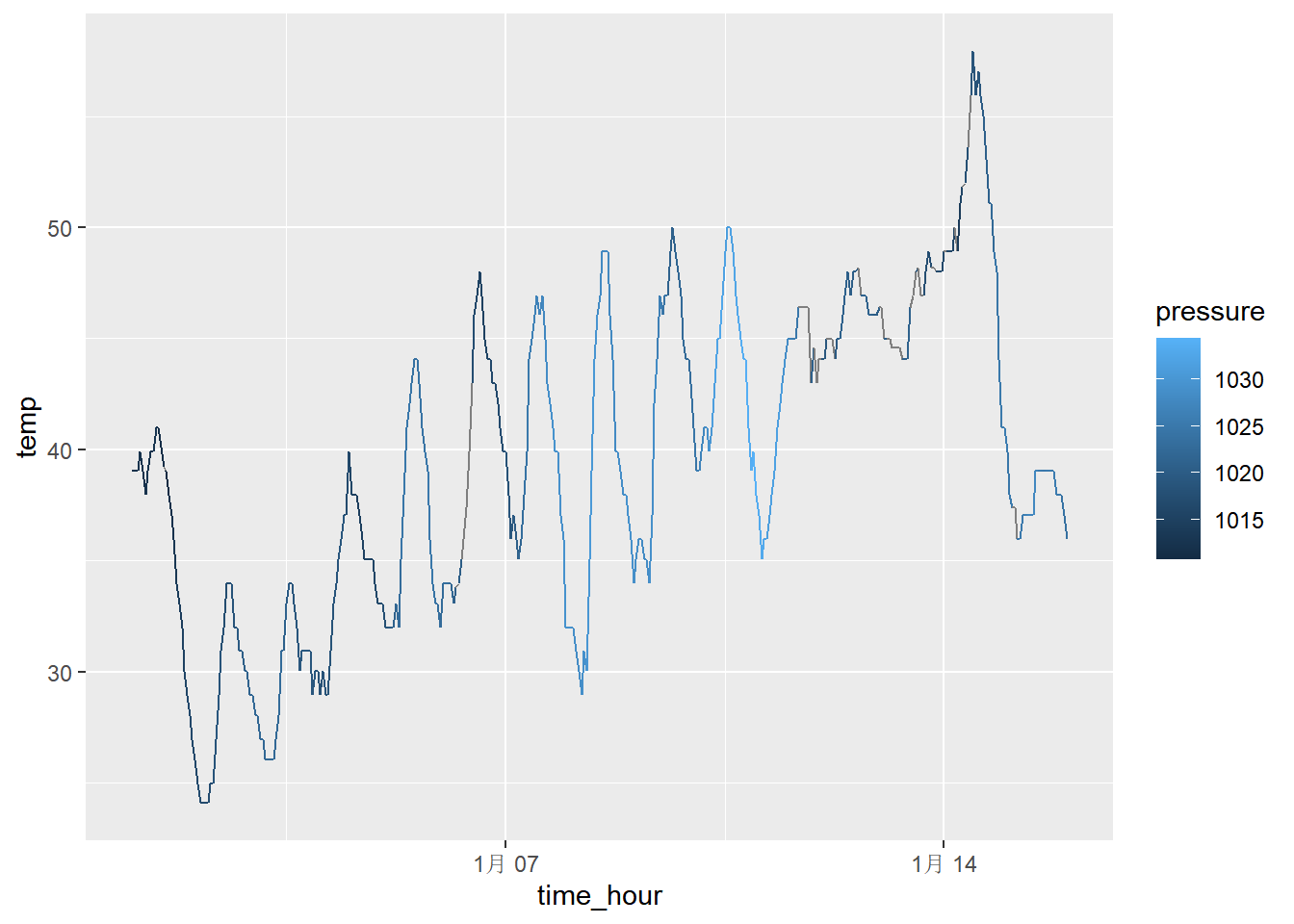
2.4 直方图
2.4.1 直方图的运用
假设现在我们关注wether数据库中的temp变量,不关系它与时间的关系,而是关注它们的分布比如:
- 最低和最大值?
- 中位数,众数?
- 数值是怎么分布的?
- 频数最多或者最少的是哪些?
为了展示这些数据,其中一种方法把这些采样点绘制在一条水平线上,如图2.5。

图2.5: Plot of hourly temperature recordings from NYC in 2013.
图2.5让我们大致了解了温度值的分布情况:观察温度在11°F(-11°C)到100°F(38°C)之间的变化。此外,在40°F和60°F之间的记录温度似乎更多。然而,由于这些点重叠太多,因此很难准确了解50°F和55°F之间的信息。通常我们会使用直方图代替。首先将x轴切成一系列的bin,其中每个bin表示一系列值。对于每个bin,计算在其范围内的温度的频数,频数用bin的高度来表示,如下图2.6
weather %>%
  ggplot(aes(x = temp)) +
  geom_histogram( col = "white")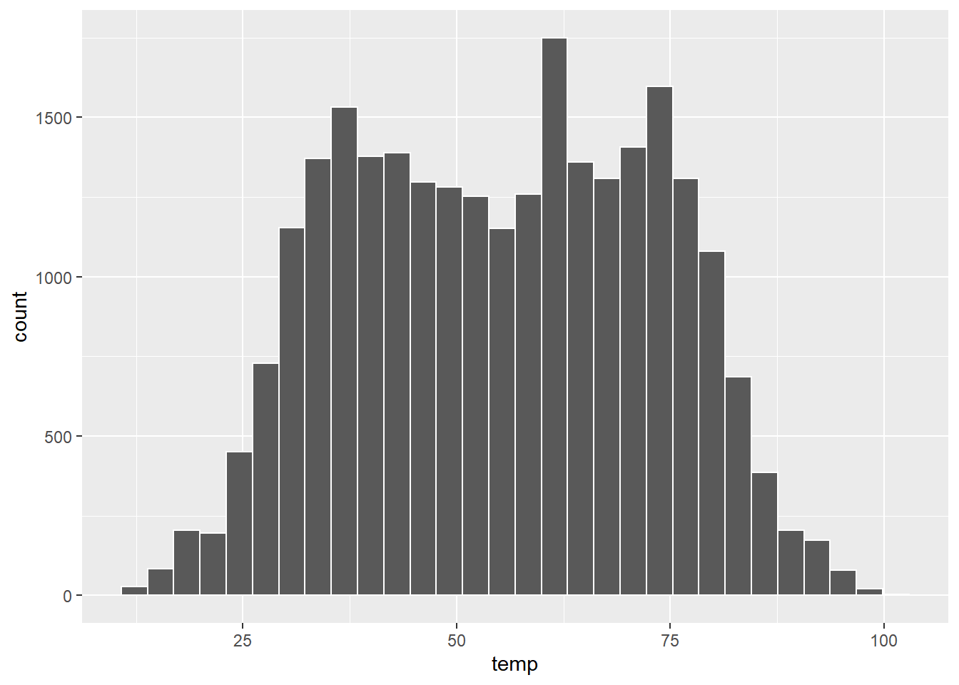
图2.6: Example histogram
现在这个图中可获取的信息更多了:
30-40°F范围内的bin高度约为5000即,约5000小时温度记录在30°F至40°F之间。
40-50°F范围内的bin高度约为4300即,约4300小时温度记录在40°F至50°F之间。
50-60°F范围内的bin高度约为3500即,约3500小时温度记录在50°F至60°F之间。
2.4.2 直方图的一些参数调整
- 调整
bin的宽度
# 40bins
ggplot(data = weather, mapping = aes(x = temp)) +
  geom_histogram(bins = 40, color = "white")
# 10bins
ggplot(data = weather, mapping = aes(x = temp)) +
  geom_histogram(bins = 40, color = "white")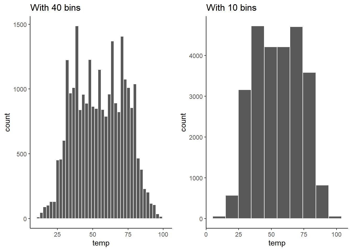
图2.7: Setting histogram bins in two ways.
- 分面
facet_grid
2.5 箱图
2.6 柱状图
3 统计推断
3.1 分布和p值
infer1 %>%  visualize() +
  shade_pvalue(obs_stat = ob_diff, direction = "left")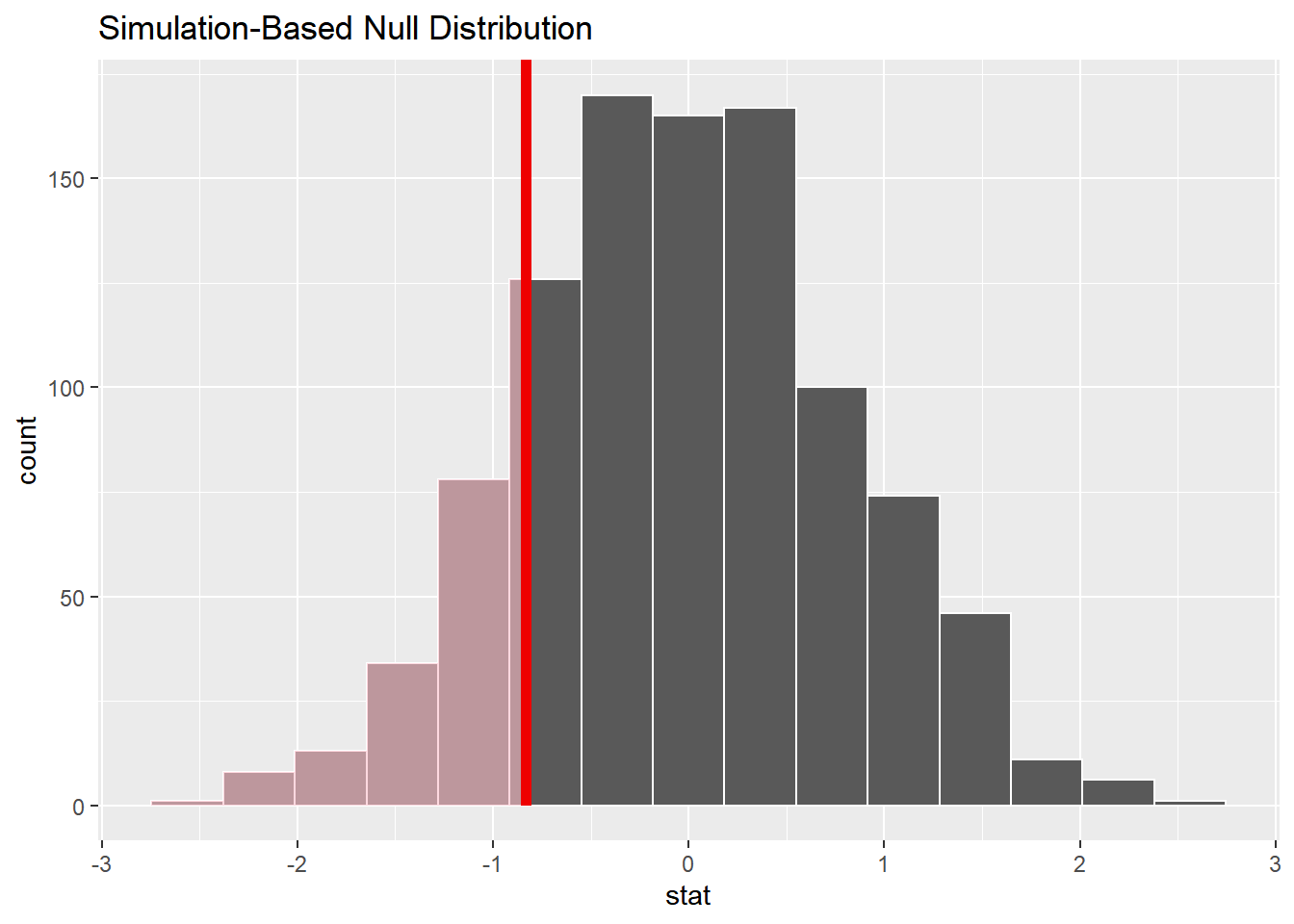
infer1 %>% get_pvalue(obs_stat = ob_diff, direction = "left") # # A tibble: 1 × 1
# p_value
# <dbl>
# 1 0.156参考文献